Design is not just what it looks like and feels like. Design is how it works. – Steve Jobs
As a Front-end developer with some background in design, it pains me to see how often “design” is being understood as something separate from “functionality”.
Images, videos, graphics, fonts, animations and scrolling effects can be essential to sites we are building. Yet we should not overlook the impact these things might have on browser’s performance. Our main goal is to deliver fast and performant experiences regardless of user devices or network capability.
If we are not cautious with our choices we can end up with bloated codebases, heavy imagery, blocking styles and scripts. This can prevent the browser from delivering optimal experiences to site’s visitors, especially if they are on mobile.
53% of mobile users abandon sites that take longer than 3 seconds to load [Source: Google DoubleClick blog]
In the modern Front End development process we should be considering these as essential parts of the Design:
-
Size of the DOM and assets (images/graphics)
-
CSS Complexity
-
Scrolling smoothness and Animation FPS
-
Time to interactive, Speed of visual progress, User input response time
-
Parse time, Execution time and Heap size of JavaScript
19 seconds is the average time a mobile web page takes to load on a 3G connection [Source: Google DoubleClick blog]
Fortunately, there are tools that identify performance issues and help address them.
Chrome’s Lighthouse Audit
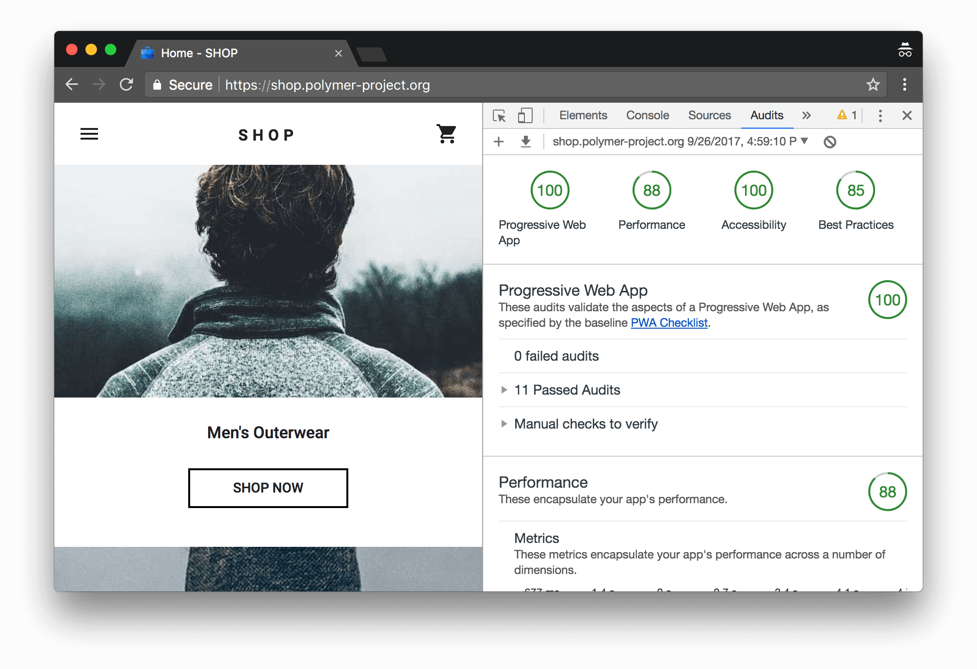
**Lighthouse** is an open-source, tool that provides a comprehensive set of tests for measuring the quality of web pages. It will give you tips on improving Performance, Accessibility, SEO, Best Practices and Progressive Web App (PWA).

To use Lighthouse, right click and select “Inspect” on any webpage. You should see the “Audits” tab in your DevTools panel (Chrome 60 and up).
Let’s focus on images
Optimizing images often yields the greatest performance improvements.
Images are still the number one cause of bloat on the web. Images take up massive amounts of internet bandwidth because they often have large file sizes.[Addy Osmani, Software Engineer Google]
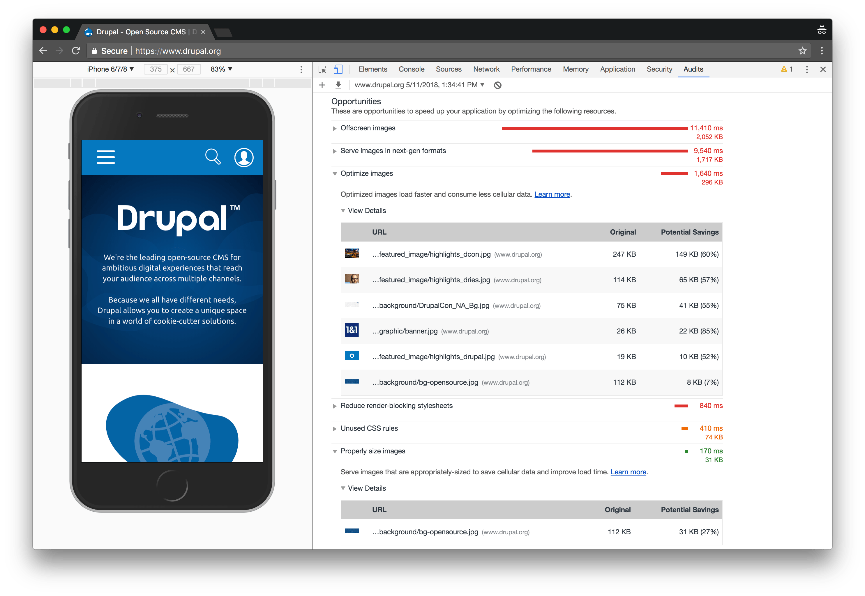
Lighthouse will identify images that can be optimized and sized depending on screen resolution. It will also identify images that are off screen (below the fold) and can be lazy loaded.

We are not always in control of how images are being added to the site. They can be uploaded by content creators through a CMS e.g. Drupal. Our priority is to setup appropriate workflows so that the images are properly sized, use appropriate resolutions and lose any unnecessary metadata before being served to the browser.
Using Image Optimization Tools and Processes
To manually optimize images we can use **ImageOptim **and **SVGOMG** for vectors.

To make it easier, we can automate these optimization processes incorporating an **Imagemin** into our build process through Gulp or Webpack.
Properly sizing images
Use **responsive images with <img srcset>, <picture> and Media Queries to load appropriate sizes depending on device resolution.
Using a CDN
By using a CDN like Cloudinary (has a free tier), Imgix or Akamai. You will basically delegate image optimization process to these services.
Lazy-load offscreen images
Offscreen images, e.g. images below the fold or carrousel images not in the view, should be lazy-loaded to improve page load speed and time to interactive.
70% of mobile pages take nearly 7 seconds for the visual content above the fold to display on the screen. [Source: Think with Google]
With the help of an IntersectionObserver we can intelligently determine when an image in the DOM enters the visible viewport and only load images that are are actually visible. There are libraries that can easily be incorporated for this purpose: lazysizes, lozad.js, blazy, yall.js.
Alternative image formats
**WebP** is a recent image format from Google aiming to offer lower file-sizes. WebP’s compression can be 25–34% smaller than JPEG and PNG. Browser support is at around 74% at this point. If you are using animated GIFs consider serving them as videos <H.264/MPEG-4> as that can shave 80% or more off a GIF’s file-size.
For a very in-depth review and many other practical tips about images on the web check out the **Essential Image Optimization** eBook by Addy Osmani
Lighthouse helps you identify issues that could slow down your website and gives you practical tips on how to address them. Optimizing images leads to a faster, cleaner and more performant web. Improve performance and you will improving design.